Logo
The same mark, for both lines.
Introducing our logo
Our logo reflects clarity, precision and restraint. It is a lowercase word and a single colored dot — a mark built to state the name and then get out of the way, because the medicine is the serious part. The dot is the element that carries the brand: it is the only thing we color, and it tells you which line you are looking at. Whether it appears on a bottle, an app screen, a lab result or the box it arrives in, it stays the same mark — drawn once, never redrawn.
Men's and women's
Switch between them. The letterforms don't move — both marks are the same drawing, down to the path data. Only the dot changes: Keen Blue for men's, Radiant Orchid for women's. That is the whole difference, and it is why there is one logo rather than two.
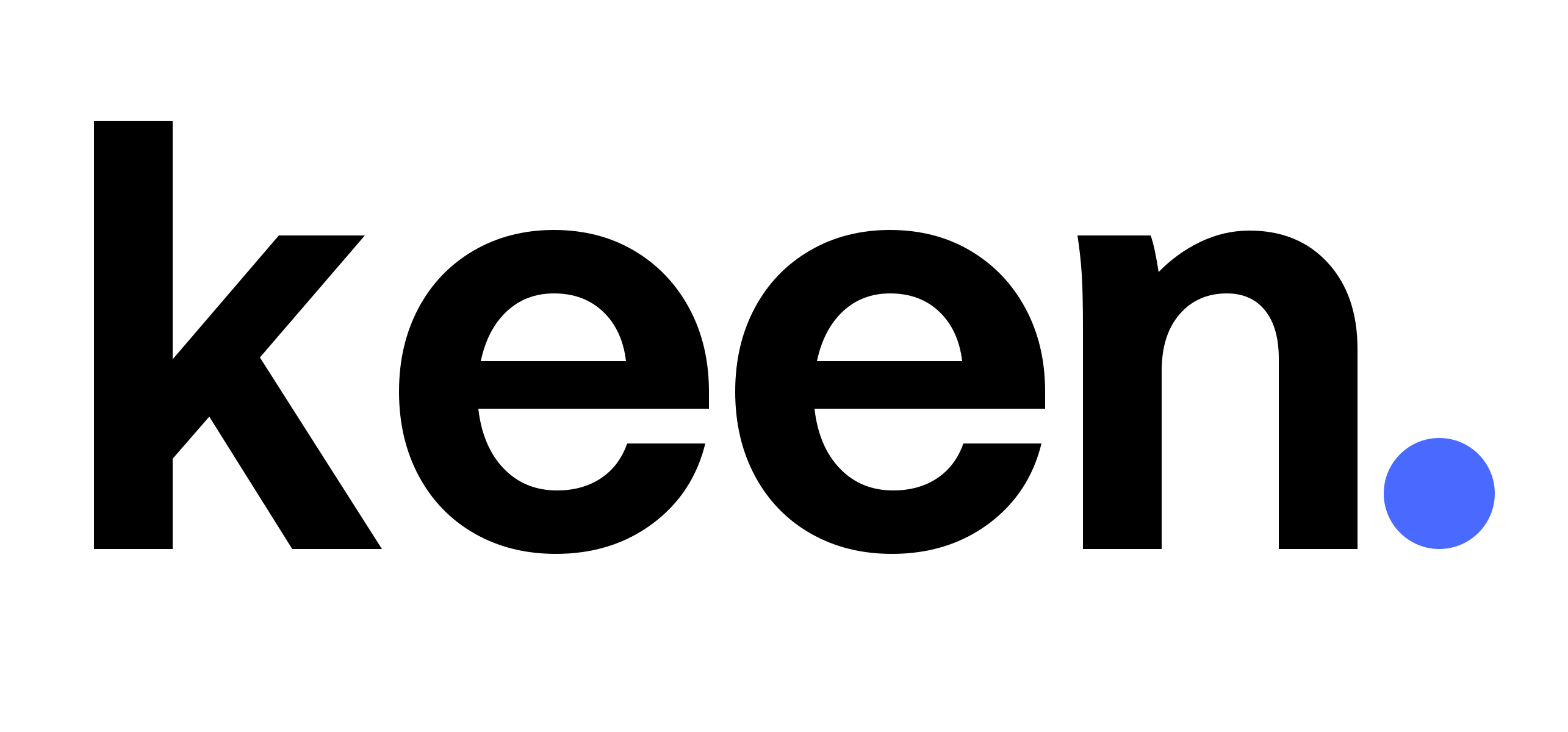
The letters move, the dot doesn't
Pick a line, then step through the surfaces. The letters flip between black and white so the mark stays readable on whatever it lands on; the dot keeps its line color throughout. Two ink versions, four surfaces, one mark.
Light background
The mark needs room to read
Clear space around the logo keeps it balanced and legible at any size. Nothing enters that zone — no text, no rule, no image edge, no other logo. The measure is relative to the mark itself, so it holds whether the wordmark is 14 pixels tall or a metre wide.